Dashboard
The Dashboard is the permanent hub for tracking sales performance and branch status. It is divided into two main sections: a section of fixed, at-a-glance metrics, and a section of detailed analytics that changes and responds based on the filters you select.
1. Key metrics (fixed top bar)
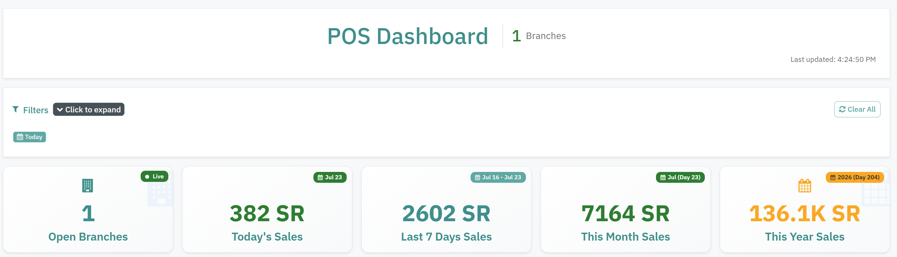
This section is designed to give a quick, direct view of actual, ongoing performance. These figures are not affected by changes to the dashboard's date filters — they always display performance up to the current moment. This section includes:
Open Branches: Shows the number of branches that are currently open and receiving orders.
Today's Sales: Total sales for the current day so far.
Last 7 Days' Sales: Total cumulative sales for the past seven days.
This Month's Sales: Total sales from the start of the current month through today.
This Year's Sales: Total sales from the start of the current year (showing the number of days elapsed so far this year).
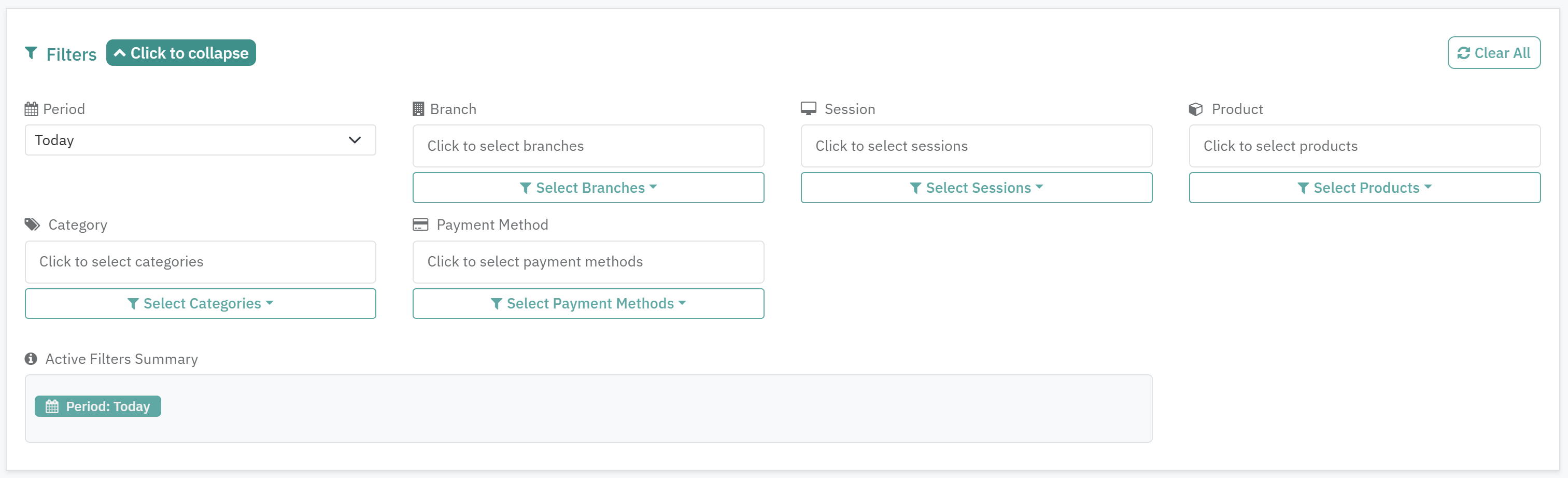
2. Advanced filtering tools
The dashboard offers flexible options for customizing the data shown in the charts. You can filter the data and analytics below based on the following options:
Date Range: Such as Today, Yesterday, Last 7 Days, or Last 30 Days.
Branch: To view and analyze the performance of a specific branch independently.
Product or Category: To track the sales of a specific product or category and monitor its performance.
Payment Method: Shows sales made in cash or by card.
Session: Sales for a specific work shift.
3. Analytics and charts (dynamic section)
All the figures and charts in this section update automatically based on the options you select from the filtering tools mentioned above. It includes the following analytics:
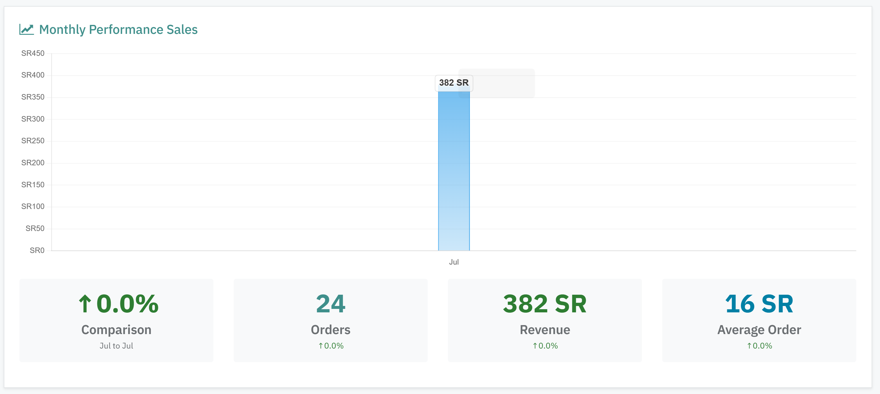
Performance Summary for the Selected Period: Shows three key figures: total number of orders, total revenue, and the average order value.
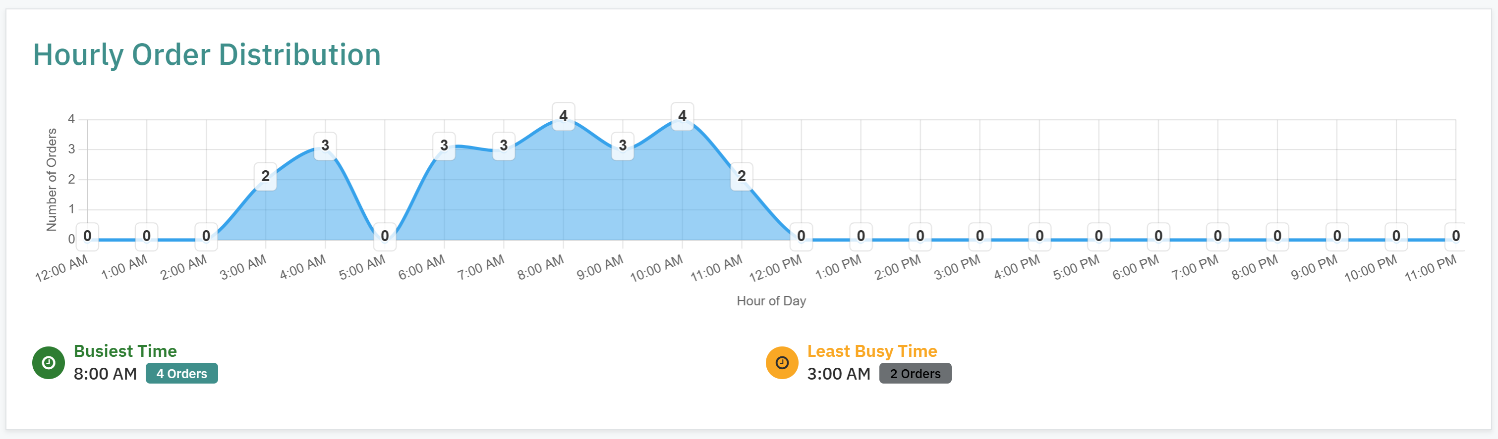
Hourly Order Distribution: A time-based chart showing peak times and the least active hours, which helps you understand customer behavior and plan working hours and staffing.
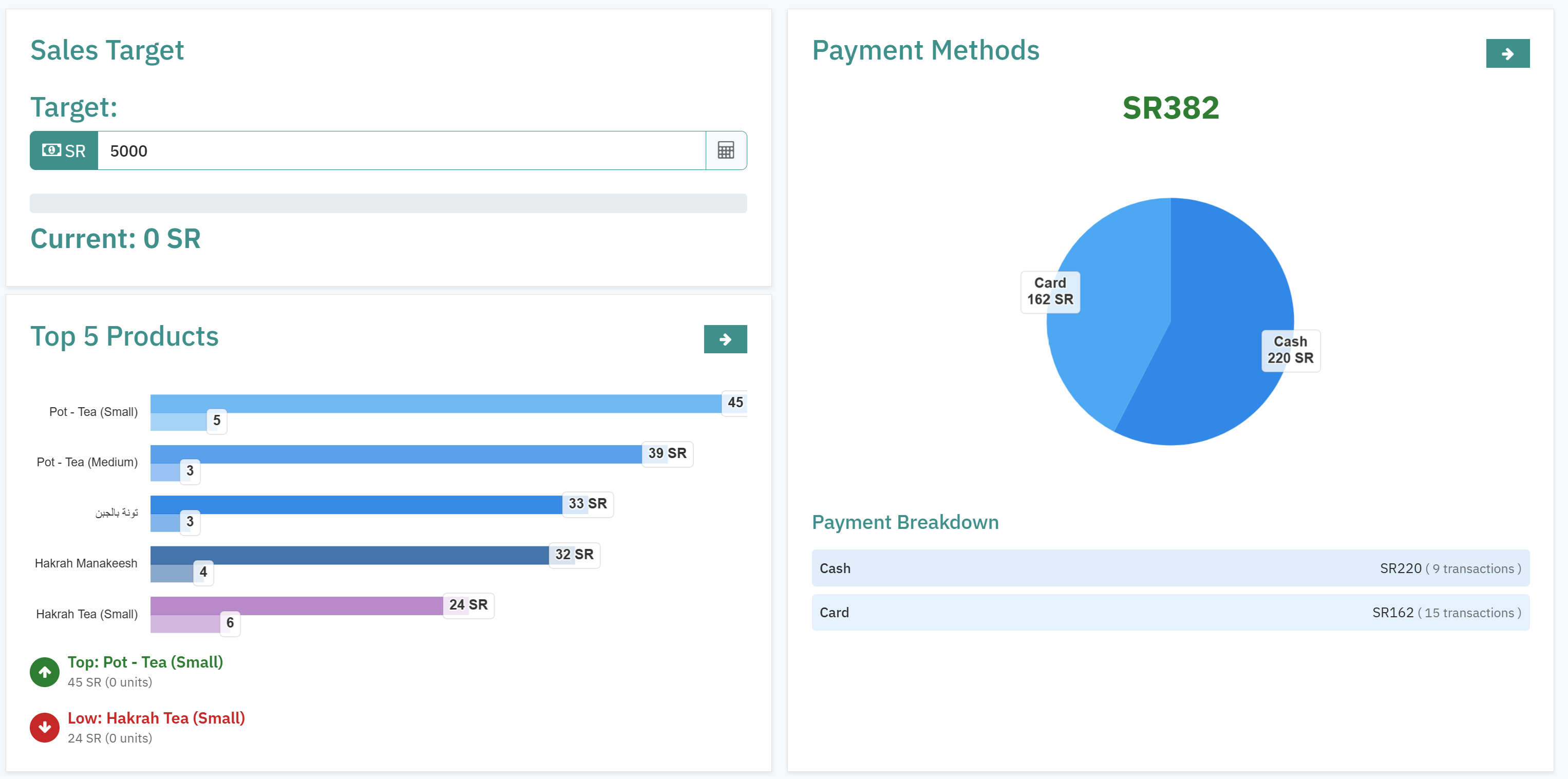
Top 5 Best-Selling Products: A chart showing the most-ordered products during the selected period, with details for each product covering “Quantity Sold” and “Total Sales Amount”.
Payment Method Distribution: A pie chart showing the percentage and total amount collected through each payment method (card vs. cash).